A documentary is taking a subject that interests you, and conveying the information needed for the documentary in a way that suits the target audience in a way that will make them excited to watch the documentary.
What is a documentary?
A documentary is a non-fictional motion picture intended to "documentary reality",primarily for the purposes of instruction, education or maintaining a historical record.
How do you expect a documentary to be constructed? What events often happen in a documentary?
I expect a documentary to be constructed in a way of telling people in depth about a specific topic. It should be informative and easy to follow along, I expect there to be footage of the specific topic so people can see the topic your talking in a visual aspect. Also live interviews are always good to have in documentary because we can see their opinions and what they think about your topic.
Define the different sub-genre of documentary
Documentary Definition
A nonfiction story told through moving images and sound.
Docudrama-A dramatised television film based on real events.
Historical- A documentary that is based on real facts of someone or something (footage is usually included in this type of documentary).
Biographic-A biographical film or biopic is a film that dramatizes the life of a non-fictional or historically-based person or people. Such films show the life of a historical person and the central character's real name is used.
Autobiographic - An autobiography is the story of the life of a person, written by that person himself.
Nature- A nature documentary or wildlife documentary is a genre of documentary film or series about animals, plants, or other non-human living creatures, usually concentrating on video taken in their natural habitat but also often including footage of trained and captive animals.
Science- A science documentary is a film that portrays science to the public in a way that is engaging, entertaining, and educational.
Ethnographic- An ethnographic film is a non-fiction film, often similar to a documentary film, historically shot by Western filmmakers and dealing with non-Western people, and sometimes associated with anthropology. Definitions of the term are not definitive.
Travel- A travel documentary is a documentary film television program or online series that describes travel in general or tourist attractions without recommending particular package deals or tour operators. A travelogue film is an early type of travel documentary serving as an exploratory ethnographic film.
Advocacy/crime- This is mostly about true crime . They dive deep into the stories of real people committing acts that are sometimes so twisted and heinous, they seem stranger (and certainly more gruesome) than fiction. Advocacy documentaries seek public support for or recommend a particular cause or policy.
Rockumentary- a documentary relating to rock music.
Poetic Mode- The Poetic mode of documentary moves away
Case study 1:Happy-A mental Health Documentary
What is the documentary genre for this short documentary?
It is an Autobiographic documentary.
What conventions of a documentary does it use and why?
It's very informative and educational because in the beginning he explains what types of depression there are. Also he interviewed 3 people and got their views on depression. It was interesting one of them didn't have any mental health issues and two of them did. Seeing their views really showed me the difference between someone with depression and someone who doesn't have depression people who have depression can't escape it and feel isolated and helpless but people who don't have don't understand the feeling of depression and you can see that in the documentary. Also he included depression hotline's at the end just in case someone who has depression wants to reach out for help which is very important if someone who has depression is watching the documentary.
What documentary modes are used and why
The documentary uses a poetic mode. This is because when the people were being interviewed sad music plays in the background as they are speaking, this sets the mood of the documentary because we know that depression is something serious and its an upsetting topic to talk about so putting sad music in the background fits the documentary it relates to the subject. Also when they were being interviewed they were talking to the audience about how they feel about depression and how it affects them. This makes the audience sympathise with them as two of the people who were being interviewed suffer from depression, which shows us as the audience how depression can really impact someones life. Also he also used a performative mode as the film maker himself spoke about depression. He talks about how he views depression and what he thinks about the topic. This is effective because as the audience we know what the film maker's opinions are as he was the one who made the documentary and why he made it.
Elements of identity
Identity is simply defined as the characteristics determining who or what a person or thing is. Elements or characteristics of identity would include race, ethnicity, gender, age, sexual orientation, physical attributes, personality, political affiliations, religious beliefs, professional identities, and so on. In campaigns they use logos to show their identities because it shows them as a brand because every brand has a different logo which makes every brand unique.
Identity describes personally meaningful aims and beliefs as they pertain to a consistent sense of who one is and who one hopes to become.
The 38 degrees identify
The bright orange colour stands out which catches people's attention because it's so vivid and luminous. Also the slogan (people,power and change) is simple and memorable, the catchphrase draws the audience to the brand it's an effective slogan. Also the brand is called 38 degree and in the logo it shows a 38 degree angle which is smart because people will remember it it's a clever marketing technique. In all the logos they use the same typography its's nice that they don't change their font they keep it clear and simple.
Different styles of type
Sans serif=In typography and lettering, a sans-serif, sans serif, gothic, or simply sans letterform is one that does not have extending features called "serifs" at the end of strokes. Sans-serif typefaces tend to have less stroke width variation than serif typefaces.
Serif=In typography, a serif is a small line or stroke regularly attached to the end of a larger stroke in a letter or symbol within a particular font or family of fonts. A typeface or "font family" making use of serifs is called a serif typeface, and a typeface that does not include them is sans-serif.
Slab serif= In typography, a slab serif typeface is a type of serif typeface characterised by thick, block-like serifs. Serif terminals may be either blunt and angular, or rounded.
Script faces
Engraving script
Handwritten script
Experimental jetset
My poster is inspired by experimental jetset. They use sans serif font so I decided to do the same I used the two fonts impact and Sukhumvit Set. Impact is the bold font I decided to use a bold font because bold text in posters help emphasize a remark or comment it stands out and people can see it big and clear. Also, my idea was about littering harms the environment and it's so normalised these days, people will throw their rubbish on the pavement which isn't good because litter can pollute the air which isn't beneficial to humans and animal and it needs to stop! I thought it would be a clever idea to put the word littering into different places to represent litter, people scatter rubbish everywhere so I wanted my poster to symbolise that. Also, I used two colours instead of one because I thought it was boring to stuck with just one colour and blue is a bright colour so it will stand out.
Experimental Jetset is now a small graphic design collective that makes printed matter and site-specific installations. With their roots in zines, punk-rock posters, and band T-shirts, the artists now find inspiration in everything from de Stijl the Dutch modernist movement founded in 1917 to “Total Football,” a theory of egalitarian teamwork in soccer. Neither a crew of individual designers nor a large agency, Experimental Jetset contend that their group of three is “small enough for everybody to feel involved, but it’s large enough to have the benefit of the collective; that magical feeling when the whole turns out to be more than the sum of its parts.They describe their methodology as “turning language into objects,” and view graphic design as a platform for “creativity, authorship, and self-expression,” designing typography, posters, T-shirts, pamphlets, and installations for institutions.
https://www.moma.org/artists/32472
The one of the top i'm not a very big fan of because you can't understand the wording on the poster. If I personally saw that poster I wouldn't know what it is about because both of the text overlap each other. They might have done this because of the aesthetic because maybe they wanted to be different and unique. Another reason they might of done this is for people to figure out what the people says, it makes it more interesting because it's not a poster that is straightforward and easy to understand you have figure it out.
Batman Begins
Hero-Bruce Wayne
Villian- Scarecrow
Princess- Rachel Dawes
False hero- Hneri Ducard
Helper- Alfred Pennyworth
Doner- Lucious Fox
Sherk
Hero= Sherk
Villian= Lord Farquaard
Doner= Muffin man
Princess= Fiona
Helper= Donkey
False hero= Prince charming
Equilibrium:
Shrek is happy living in a swamp
Disruption:
Donkey and other fairytale creatures are forced to move into the swamp by Lord Farquaard
Recognition
Shrek is unhappy with his new house guests
Repair
Shrek and Donkey travel to Lord Farquaard palace and agree to recuse princess Fiona
New Equilibrium:
Shrek and the princess fall in love.
Camera practise
Aperture 8.0 Shutter Speed 1/20 ISO 400
Aperture 4.0
Shutter Speed 1/90
ISO 400
Aperture 2.8 Shutter Speed 1/180 ISO 400
Aperture 16.0 Shutter Speed 1/6 ISO 400
Photography
The aperture of this shot is very dark its a large aperture. The cars are still there but we can barely see them not everything in this picture is in focus only the sun is, which puts all the attention to the sun is the clearest thing in this image. The darkness makes the sun much more luminous and bright which gravitates people to look at the sun. This is a long shot it was quite easy to take this image because I just lowered the brightness of my camera and adjusted the focus the illusion was to make this picture look like it was taken at night but in reality, it was taken in the daytime and I achieved that which I glad about because that was my goal .
The shot is a low shot. This is a small aperture image because everything is clear we can see the clothing, shoes, ID's everything is in focus. The low shot makes us appear much larger and wider and taller it's giving that effect although we are not, which showed me that angles make a differences and all of them give a different illusion. This shot was quite easy to take because I needed to put my camera above to create this shot.
This shot is a close up shot. This shot was the easiest to do because we just needed to put the camera up close to achieve this shot. However, it was quite difficult to focus the camera it kept getting blurry or the lighting would dull down, as I processed to bring my camera closer, but after adjusting the camera focus it was perfectly fine this picture uses a small aperture because everything is clear in this image.
This aperture of this shot is very dark it's a large aperture. The only thing that is in focus is the chair and the door everything else is blacked out. When we see this image we automactially see the chair straight away because it's the main focus of this image and its the only thing that is clear to us because of the bright white light this is a long shot.
This photo was taken at the smokers area in college. The use of lines is impactful because they lead to the other fence. The carved names show history of the people that were there. I did a close-up shot of the wall to capture the carving and left the background out of focus so we can keep the attention on whats in the front as the background is unnecessary this shot was easy to capture because I just adjusted the camera so that the wooden wall was in focus.
Constructivists
Write about the Constructivists
Constructivism was the most influential modern art movement in twentieth century Russia. With its aesthetic roots fixed firmly in the Suprematism movement Constructivism came fully to the fore as the art of a young Soviet Union after the revolution of 1917. The movement was conceived out of a need for a new aesthetic language; one benefitting of a progressive new era in Soviet socialist history.The shared goal of the founders of Constructivism was to produce artworks and buildings using modern materials and designs that would awaken the proletariat to imperialist class divisions and other bourgeois inequalities.Constructivist art often aimed to demonstrate how materials behaved and to test, for instance, the properties of materials such as wood, glass, and metal. The form an artwork would take would be dictated by its materials rather than in traditional art practice whereby the artist transforms his or her base materials into something different and possibly beautiful. These inquiries were often in and of themselves
Constructivist art had evolved to accommodate the idea of Productivism which took the aesthetic principlesthe early 1920s of Constructivism and applied them to “everyday” art such as photography, fashion, graphic and textile design and cinema.
Include 3 designs you like and caption them
Who designed it?
The artist who designed it was Alexander Rodchenko.
When?
1924.
What was it for?
Knowledge ( Advertisement Poster for the Lengiz publishing house).
Give your opinion?
This is my favourite poster because I like the layout of the poster. I love how the sans serif font is slanted and it's not just on a straight line also it looks like he's yelling the words out it looks like a microphone which was a smart and unique idea that I liked about the poster. Also the bold red and black colours really emphasise the poster so that his point can get across as this poster is regrading a social issues.
Who designed it?
Kazimir Malevich.
When?
1915.
What was it for?
Suprematism.
Give your opinion?
I like this poster because of the different abstract shapes. This poster is kind of mysterious because looking at it of the first time I didn't really understand it, it's unique and different which makes it likeable because this poster doesn't have any words or people in it its just shapes.
Who designed it?
The artist who designed it was El Lissitzky.
When?
1924
What was it for?
Self-Portrait (The Constructor)
Give your opinion?
I like this poster because it's interesting to look at. I like how the hand overlays the face it looks very dynamic and different. Also the eyes on the hand add a unique touch.
Find examples of each of these designers that shows inspiration from the constructivists
Shepard Fairey
Frank Shepard Fairey is an American contemporary artist, activist and founder of OBEY Clothing who emerged from the skateboarding scene. In 1989 he designed the "Andre the Giant Has a Posse" sticker campaign while attending the Rhode Island School of Design.
Fairey has been involved in various controversies mainly related to the allegations that he uses other artists' work without permission. Critics have also accused Fairy of selling-out to produce his Obey clothing line, manipulating politically charged imagery, and hastening the exploitation of street culture.
Paula Scher
Paula Scher is one of the most influential graphic designers in the world. Described as the “master conjurer of the instantly familiar,” Scher straddles the line between pop culture and fine art in her work. Iconic, smart, and accessible, her images have entered into the American vernacular.
Brand Identity
One of Paula's greatest achievements was being the first designer to create a new identity and different promotional graphics for The Public Theater in 1994. This included creating the logo, large-scale billboards, posters and even stationary.
David King
King’s poster designs are a visual history of the global political radicalization of the late 1960s and early 1970s, including the Anti-Apartheid Movement in South Africa and the Anti-Nazi League in Britain. King’s poster art came at the end of an era when printed posters were the primary means of communicating political.
My poster
I created my poster on Illustrator. The process of making my poster was very easy because I knew what I wanted my poster to about and how I wanted it to look. I thought it was smart to add the flag in the background so that I can the represent the country because my poster is about Palestine. I also wanted to add a female instead of a male in my poster because I wanted to show how brave women are and how courageous they are about their country, they can fight for their country as well gender shouldn't matter I wanted to show equality. She's also wearing the Palestine colours so this also shows the representation of Palestine which is important as people will remember it more. The main reason I chose to do to make a protest poster for Palestine is because it needs more attention to the media, also people need to know how many innocent families are getting killed everyday we need talk action!. I support Palestine myself in my opinion I think its disgusting how Israeli people are taking vulnerable Palestinian families lives, bombing their homes leaving them with no home to live in; shooting them, for example a 16 year old Palestinian teenage boy was shot dead by Israeli military forces when hurling rocks at Israeli vehicles this is so wrong you don't kill an innocent child for throwing rocks that's not normal that child has so much to live for and now he's no longer here it's very frustrating and upsetting, people need to open there eyes and see what's really happening to in Palestine nowadays and this needs to stop immediately before more families live in fear.
Over 700 people have died in Gaza as of today.There is no justification for innocent Palestinians dying. And there's no excuse for Israeli's to do this to these civilians in incidents like the killing of four children on a Gazan beach. Those horrific images of injured and dead innocents flood the media and still nobody wants to support Palestine it makes you question what has this world become? people are delusional nowadays they need to research before they speak about this issue as it's very serious and we shouldn't speak without providing evidence. FREE PALESTINE UNTIL ITS BACKWORDS!!.
https://www.timesofisrael.com/palestinian-teen-rock-thrower-shot-dead-by-israeli-army-in-west-bank/ = The article about the Palestinian boy
Surrealism
What is Surrealism?
Surrealism is a cultural movement that developed in Europe in the aftermath of World War I in which artists depicted unnerving, illogical scenes and developed techniques to allow the unconscious mind to express itself.
Why is Surrealism used in campaigns?
Surrealism is used in campaigns since it gives off a unique touch because the art style is different from what people see regularly. Because it's different it tends to attract people more because Surrealism makes people think differently because the image doesn't tell you what it is about, it's not as straightforward because they use odd images which makes you question that the poster has a much more deeper meaning to it but we have to figure it out this imagery makes you remember the poster more because of how unusual it is.
Select one image from Lex Drewinski, Michal Batory , Jan Svankmajer or Roman Cieslewicz
The artist who made this is Lex Drewinski.
Explain what it was created for and your response to it.
This was created to show the difference between the rich and poor. As we can identify form this image the poor is reaching for rubbish out of the garbage bin however the rich are throwing their rubbish in the bin. This shows that poverty has massively impacted people's lives and people suffer without food while's others have food waiting for them, this causes poor people to search bins for food so that they can survive which is upsetting because if they don't find any food they live in hunger. The rich have lots of privileges they have clean clothes ,food ,clear water and roof over their heads they live the house with a full stomach they have everything to benefit them, while the poor starve and suffer. Lex was trying to show that poor people struggle to live rich people don't have many worries they have everything life isn't fair. My opinion on this poster is that it really symbolised how different classes live their lives. It showed me that this poster has a much more deeper meaning it's not just two figures looking for rubbish or throwing rubbish, I love his art-style because you as the audience have to figure out the meaning of this poster and everyone has their different opinions so everything will think differently which is a amazing idea because you can hear what others think of this poster.
Describe how it appeals to an audience.
This may appeal to the lower working class because they could relate to this. They know the struggles of living in poverty this will impact them more than the upper class as they are effected by this issue people of this class, few of whom have finished high school, suffer from lack of medical care, adequate housing and food, decent clothing, safety, and vocational training. This makes us feel sympathy for the poor because they have it completely different from the rich which isn't fair.
Select an example of surrealism in advertising and analyse its appeal
Describe the surreal elements, what is surreal about it?
Link it to the target audience
Explain the positive reasons for using surrealism
Are there any drawbacks?
This poster stuck out to me the most because I love how the bottle has so much life to it. As we can identify there is a path it looks like the path leads you to another dimension because in the outside it seems to be wintertime, because of the polar bears and frosty, snowy mountains but inside the clear bottle the weather changes it seems to be spring or autumn season which is a concept that I thought was very well done I love how unique it is. Surrealism is shown by the bottle having nature in it for example the forest in the clear bottle and the island with trees and giraffes we wouldn't see this in real life, for instance the Evian water advert just has the water bottle in it looks like a normal water bottle advert, but however this one has a narrative to it it's not just a regular water bottle advert they made it more interesting and surreal its probably something that you've never seen before. This really attracts the audience's attention because of how colourful it is and how unique it is, it's definitely a poster that they will remember. A positive of using surrealism is that your poster will stand out more because surrealism is usually used in posters to make them unusual and different. The drawbacks are that people may find not like your poster because of how odd it is, these days humans like things that are not different they like things that are trending and that everyone else likes so your poster may not have that much attention because of that reason.
Documentary: TAGS and Psychographics
Poverty
As I am doing my documentary about the effect of poverty, I want my target audience to be people from different classes and I want them to explain how their living styles are and why they belong to that class. For example I will interview someone for a much poorer class and someone from a middle class or upperclass so I expect everyone to have different points of view. By interviewing different people my audience can see how poor people struggle from poverty and the rich/middle class can afford to survive. Poverty is a big matter that is effecting people on a daily basis, people need to see how they are living in this society and how much they suffer.
Designers and Social issues
Write about the work of these designers/ organisations, focussing on work on social issues - include at least one image for each - include your personal response
Tibor Kalman
Tibor Kalman was a renowned American graphic designer. He is recognized for his position at Color magazine as an editor. Color focuses on multiculturalism and global awareness, the viewpoint was represented through typography, bold graphic design and images. The magazine also ran a series which featured the renowned figures for instance the Pope and Queen Elizabeth as racial minorities. This is what Tibor said about real issues that are happening in society, "Whether we can do something with design that makes a difference in the world. Whether designers can use their skills to create change - cultural, political and economic". Tibor is saying that more designers should pay attention to social issues they should raise awareness by using their skills to create posters for people to see so that there is a change in this corrupt world we are living in. In the early 1990's Tibor helped produce a series of controversial advertisements focusing on AIDS, racism, refugees, violence, and warfare for Benetton. The ads led to the creation of Benetton's own magazine Colors quickly became the primary outlet for Tibor’s most progressive ideas.
Collage consisting of spreads and covers from Colors magazine. (From top left to right:
1. cover of the first issue of Colors,
2. cover of issue 7 of Colors,
3. a page from the issue 4 of Colors presenting Queen Elizabeth with a dark skin complexion,
4. a spread from the first issue of Colors.)
https://www.eyemagazine.com/feature/article/reputations-tibor-kalman= Tibor interviewAdbustersAdbuster magazine is the people's bi-monthly journal of the mental environment. They are a global collective of writers, artists, designers, musicians, poets, philosophers and punks. Since 1989 they've been smashing ads, fighting corruption and speaking truth to power. They are trying to forge a new way of living create a whole new cultural vibe to escape the capitalist paradigm and halt humanity's slide into a 10,000-year dark age. It was founded by Kalle Lasn a Canadian-Estonian filmmaker, activists and writer and Bill Schmalz, a wilderness cinematographer. They focus on calling out capitalist ideologies, consumerism and animal rights and although they are heavily against corporate advertising, ad busters use marketing to tier advantage to bring attention to their campaigns such as 'Buy nothing day' and 'Unbranded America'.
Brandalism Brandalism is a revolt against the corporate control of our culture and space.They are an international collective of artists and activists that confront the power of big business and their public relations advertising. Intervening into ad spaces that usually celebrate consumption Brandalism use ‘subvertising’ as a lens through which we can view the social and environmental justice issues created by late stage capitalism. Their interventions, exhibitions and workshops aim to agitate, educate and facilitate those who want to challenge corporate power they first appear in the summer Olympics 2012 and that was when Brandalism was official.
Led by DonkeysLed By Donkeys is a British political campaign group established in December 2018 as an anti-Brexit group but which has also criticised other actions of Boris Johnson's government.which is reflected through all of their campaigns and messages.The quote "Lions led by donkeys' this quote came from the first world war and was used to describe how the British Infantry were so incompetent and let many British solider to their deaths. The four founder of the campaign group are Oliver Knowles, Will Rose, James Sadri and Ben Stewart.
Surrealist photography Surrealism was discovered in the mid 1920's during the first world war in Paris. There was a famous poet Andre Breton who decided to talk more about the art style in "Manifesto of Surrealism" in 1924. He talked about different art styles and how art doesn't have to be the traditional art that you would see in the art industry you can make it unique this gained a lot of attention and people wanted to know more. This new way of photography thrilled photographers and made them creative in many ways they were able to explore this new invention and make their own. The Surrealist set out to bridge between the human unconscious as expressed in the fantastical world of dreams. The original surrealists were mostly painters, writers and film-makers, although some of the Surrealist's ideas and actions may now appear somewhat bizarre and perhaps even senseless to us because of how unusual and odd it is. the Surrealists saw themselves as social revolutionaries who set out not only to upset the art world, but to free society in general from restrictive and oppressive ideas and traditions. Today’s Surrealism Photography is almost as diverse as the number of different photographers making it. For example, Spanish photographer Chema Madoz produces very traditionalist Surrealism photography, whereas South Africa-based artist Roger Ballen makes decidedly more edgy and bizarre images which shows us the different types of Surrealism.
Chema Madoz Surrealism photography
Roger Ballen Surrealism photography
Ronen Goldman
Ronen Goldman is an artist and conceptual photographer based in Israel. He specializes in creating photo-dreams, which are conceptualised images that represent various dream states. His photo-dreams are characterized by a combination of deep emotions such as happiness, paranoia, and sadness, most of these images convey a feeling of exhilaration or sheer paranoia. He first became a photographer when he was younger, and he often referred to himself as a Photoshoper. He claims that he takes all the elements that he uses in his images, and these are some of his creations.
This is one of Ronen Goldman's famous photography pieces called "We are meant for each other". This photography looks like a photo of a normal couple sitting on a bench, but however if we take a closer look at their heads they are replaced by fishbowls with goldfish inside of them. Ronen says this is one of his favourite photo because it reminds him of him and his wife which shows the representation of this piece of photography. As the audience if we didn't know this fact we would think that the couple is feeding each other as they are pinching their hands on the top of the fishbowl because that's how you would feed fish. This is such a surreal image because you wouldn't see this in reality it's unusual and odd which makes the image more appealing and eye catching to the audience because it's different and unique it draws our attention. This image could also represent their love for each other because couple's feed each other to see their affection to one other, also how close they are to one another shows that they are comfortable with each other. Also we can identify that they are holding hands which implies physical touch it gives us the sense that they are reply on one another and that they are safe which shows that Ronen relationship with his wife is healthy and secure. Lastly the pieces name "We are meant for each other" shows that Ronen and his wife are soulmates and they need each other in order to feel warmth ,comfort and love which shows how big his love for his wife truly is.
In this photo they are both showing direct address. This shows that they have a connection as they are looking at each while feeding each other, he background uses lowkey lighting but the couple is in the spotlight they are the main subject of this image suggesting that the audience focus will be on them. In my opinion I really like this surreal image because I like the meaning to it as it shows that love can be shown in different ways and visuals.
My own Surrealist photography
We were given task to create our own surrealist photographs inspired by Roen Goldman. In pairs, we had to take 20 to 40 pictures of different poses, angles and objects that we would use when we edit our photos together in photoshop. Out of all the pictures that we took I chose to create 4 surrealist photos, I used photoshop to create my Surreal elements it was very interesting to me to see how I could turn a regular image into a Surreal and unusual image with my imagination.
This was my first surreal photograph I took. I told Esi to pretend she's taking a picture of something for my main image however I had to think of an idea of how I can make it surreal. I played around with my ideas and came to a final agreement I asked my classmates for their opinion they also liked the idea that I wanted to use, my final idea was to make an illusion that Esi's soul is being taken from her body and that flowers are coming out of the camera as she is taking the photograph. I thought this idea was very surreal because, you wouldn't see flowers coming out of a camera in reality it's odd and unusual which makes it unique and different. As for the ghost illusion I wanted to do something with her main body I didn't want it to look regular as it would look boring and uninteresting, I went on Photoshop and used the magnetic lasso tool to cut out her body and then I made the body transparent so that it gives off that ghostly effect and it was a success. This is my favourite surreal image I created because I love how clear it looks and my imagination really shows in this image because I made a regular image look very surreal and way more interesting then how it looked before.
This was my second surreal image I created. As I was searching for objects to make a surreal I instantly thought of a sink as I've seen someone do it before and I wanted to create my own. My idea was hands wrapping around the sink taps which I know is an unusual idea but that's what surrealism is all about. I went on Photoshop and used the magnetic lasso tool to cut out the background of the hand image, I wanted to darken the hand colour I used the contrast effect on Photoshop to lower the contrast of the hand colour to dull down the colour so it looks more scary and horrid. This image looks very surreal because you wouldn't see this normally also its very odd and different which makes it more interesting and eye catching to look at because you've never seen image like this before.
This is my third surrealism photography I created. I wanted to do something relating to a hallway because there is so much empty space and I can add random object to make a surreal image. I decided I wanted to have an illusion that there are 3 figures of the same person Esi was my model for this photograph, how I created this was I took a photo of the hallway first then I took a picture of Esi I went into Photoshop and cut out the picture of Esi with the magnetic lasso tool, to make it surreal I placed 2 other images of Esi at the back so that it gives off that illusion that there are 3 Esi's. This was the easiest image to edit because I didn't really need to do much other than place the images how I wanted it look but I really like how freaky and clean the illusion is.
This is the last surrealism photography I created. I wanted to create something to do with the pupil of an eye because I've seen many surreal images with an eye involved so I decided to think of an idea so that I can create my own. My idea was a sea of water in the pupil of the eye I thought this idea of very surreal because, you would never see a sea of water in someone's pupil its unusual and odd which makes it a surreal idea. I created this image on Photoshop I overlayed an image of a sea of water in Fizza's pupil so it gives off that illusion that her pupil is a sea of water. Also if you look closely you can see a person in the eye it looks like the person is swimming in the water which I thought was very cool. In my opinion this image is very eye catching to look at because its unique and different and I love how smooth everything looks I was impressed with my Photoshop skills.
My Surrealism poster
This is my Surrealism poster I created. I decided to make a Surrealism poster relating to my social issue I am focusing on, poverty is a whole social issue that has impacted many people are struggling to survive many people are dying of starvation on a daily basis poverty needs to be talked about more. I created this poster on Illustrator I first started with the title I wanted my title to look like someone has written it to make it more personal I used the font Chalkduster to achieve this. For my main image I needed something surreal so I came up with an idea of a spoon that has reaching hands on it. This represents poverty because it symbolises that they are reaching to survive they are reaching for help so that they can live a better and more stable life, I thought this idea was very surreal because it's an unusual image that you wouldn't see which makes it unique and different. In my opinion I think it's very eye catching as the audience will try to figure out the meaning of the image they will all have different opinions which makes my poster engaging. To get the spoon image how I wanted it to look like I found a cartoon image of a spoon I then copied and pasted it into Illustrator and traced it using the pencil tool just so that my lines are smooth and clean. For the hand part I drew them myself which was surprising easy I just followed the shape and shaped it into hands and it was success I was very impressed with myself. For the help save a life I wanted it in a sans serif bold font so it stands out and people can see it also the colour red symbolises blood to show people that people are dying and they could save a life if they participate in this movement. Lastly with the foot image I did the same thing with the spoon image I traced it with the pencil tool on Illustrator this image was quite hard to trace because it was a big image and I had to get the lines to look as smoothly as possible. This image represents the upper class stepping on the lower class because the upper class have many privileges for example having a place to live, stability and a full stomach but on the other hand the lower class suffer and need to find ways to survive. This image is surreal because it looks like a foot and you would never see a huge foot stand on a person which makes this image surreal because it's odd and unusual. In my opinion I really like this poster and how created it because although it's surreal people can understand it and this poster has a deeper meaning than people would think it symbolises poverty as a whole.
After effects
In this lesson we learnt how to use affect effects. I've never used affect effects so this was a new experience for me but it was quite simple to understand. I decided I wanted to make an animation of bubbles I used the CC bubble effect on after effects to create the animation of bubbles, I wanted to stick with the blue bubbles so it looks realistic and it gives off that underwater effect and I really liked how it came out.
Campaign pitching
I did a pitch infront of class to tell them about my social campaign. My social campaign is about poverty I wanted my documentary to match with my social campaign my topic is on Poverty. I explained to my classmates what my social campaign will be about what I make so people are aware of my campaign and how i'm going to represent it. My classmates also gave me feedback on what I should improve which was very helpful and useful to me so when I make my campaign I know what to include and what not to include, pitching also increased my confidence skills as I was able to present to everyone clearly and confidently.
Interviews and Vox pops
https://youtu.be/tRtRO8W15Pc = My Interviews
These are the practice interviews i've done. I'm very familiar with filming interviews as i've done it last year so I was quite confident when I was creating and editing my interviews. I wanted to ask people from different age groups so that I can get different perspectives on what they think about poverty, It was interesting to see how they feel about this topic and how some people have it harder than others I will be using this topic for my final documentary because I found that it was a very interesting and powerful social issue that I explored and I feel like it needs to be spoken about more. I filmed my interviews on my phone which I won't be using to film my interviews in my final documentary on because it's not very professional and I want my documentary to be filmed in good quality and have better audio as the audio is low and it picked up a-lot of background noises which makes it hard to hear the interviewee. As for Milan's interview I did use a Canon camera but however the camera wasn't in focus so the final result was blurry also the audio wasn't the best because of all the white noise the camera picked up so we couldn't hear him properly, so next time I need to use a mic for the audio so that we can hear his voice better and I need to adjust the camera focus before filming this was a learning curve for me. I used Premiere Pro to edit my interviews which was easy for me as I just cut the clips and added a black fade transition so it looks more clear and smooth I really enjoyed editing my clips.My target audience is all ages it was great to see how different age groups relate to this topic, for my younger audience they have people to provide for them so they don't go through as many hardships financially as adults do they have carer to give them their needs. As for the older audience my interviewee (Sharmila) was on benefits and struggled financially this would make the audience sympathise with her as she has experienced poverty. This was a very good practise for me because when I do film my final documentary interviews I will know what I need to do to film a good interview so i'm glad we did practise interviews as it was useful and helpful for me to see what I needed to work on in the future.
The questions I ask my interviewees:
Photography Composition
Filming technique
A Camera shot is the amount of space that is seen in one shot or frame. Camera shots are used to demonstrate different aspects of a film's setting, characters and themes. As a result, camera shots are very important in shaping meaning in a film. They strengthen the narrative.
Extreme Long Shot
An extreme long shot contains a large amount of landscape. It is often used at the beginning of a scene or a film to establish general locations, this is known as an establishing shot.This shot frames the subject from a distance and focuses on its surroundings.
Long/full/wide shots
A long shot contains landscape but gives the viewer a more specific idea of setting. A long shot may show the viewers the building where the action will take place.
A full shot is a shot that shows the subject within their surrounding environment. A full shot tells the audience who is in the scene, where the scene is set, and when the scene takes place.
A wide shot is a shot that typically shows the entire object or human figure and is usually intended to place it in some relation to its surroundings.
3/4s or American shot
American shot or 3/4s shot is a translation of a phrase from French film criticism, plan américain, and refers to a medium-long film shot of a group of characters who are arranged so that all are visible to the camera.
Mid-shot/Two-shot/Shot reverse shot
A mid shot contains the characters from the waist up. From this shot, viewers can see the character's faces more clearly as well as their interactions with each other. This is also known as a social shot and commonly used in Two-shot's and shot reverse hot.
180 degree rule
The 180-degree rule is two characters or more in a scene should always have the same left/right relationship with each other. An imaginary line called the axis connects the characters by keeping the camera on the one side of this axis for every shot in the scene, the first character is always framed right of the second character who is then always framed left of the first.
30 degree rule
The 30 degree rule is when an editor cuts to the same character or object in another shot. The second shot must be positioned at least 30 degrees away from the first camera setup. If the camera moves less than 30 degrees, the cut between shots can look like a jump cut or a mistake.
Jump cut
A jump cut is a cut in film editing in which a single continuous sequential shot of a subject is broken into two parts, with a piece of footage being removed in order to render the effect of jumping forward in time.
Close up
A close-up or closeup in filmmaking, television production is a type of shot that tightly frames a person or object. Close-ups are one of the standard shots used regularly with medium and long shots.
The Kuleshov Effect
The Kuleshov Effect is a film editing montage effect demonstrated by Soviet filmmaker Lev Kuleshov in the 1920s. It is a mental phenomenon by which viewers derive more meaning from the interaction of two sequential shots than from a single shot in isolation.
Extreme Close Up
An extreme close-up contains one part of a character's face or other object. This technique is quite common in horror films as it creates an intense mood and provides interaction between the audience and the viewer.
Camera Angles
A bird's eye angle is an angle that looks directly down upon a scene. This angle is often used as an establishing angle, along with an extreme long shot to establish setting.
High angle
A high angle is a camera angle that looks down upon a subject. A character shot with a high angle will look vulnerable or small.
Low Angle
A low-angle shot is a shot from a camera angle positioned low on the vertical axis anywhere below the eye line looking up. Sometimes, it is even directly below the subject's feet the effect of the low-angle shot is that it makes the subject look strong and powerful.
Eye Level Angle
An eye level shot is exactly what it sounds like a shot where the camera is positioned directly at a character or characters' eye level. Considered to be a “neutral” camera angle its function is not to distort or over-dramatize a scene but rather to give the viewer a very familiar perspective.
Dutch Angle/Tilt
The Dutch Angle Shot also known as the Dutch Tilt it's a technique that consists of an angled camera shot where the horizon line isn't parallel with the bottom of the frame, and vertical lines are at an angle to the side of the frame.
Panning/Tilting
Panning and Tilting increases the audience viewpoint. It reveals more and sometimes focuses the audience on important events/objects.
Handheld shot
With handheld shots the camera is carried by the operator often creating an uneven movement. These shots allows the operator to follow action very closely, creating a greater sense of immediacy for the audience and may mimic the movement of a character in point of view shot.
A tracking shot is any shot where the camera follows backward forward or moves alongside the subject being recorded. In cinematography, the term refers to a shot in which the camera is mounted on a camera dolly that is then placed on rails – like a railroad track.
A dolly shot is a camera movement technique that cinematographers use to follow a subject in action. It is also known as a tracking shot or trucking shot. The camera is mounted over an apparatus called the “dolly" to facilitate tracking.
A Steadicam mechanically isolates the movement of the camera from that of the operator, providing a very smooth shot even when the operator is moving quickly over an uneven surface.
Zoom shot
A zoom shot is when the focal length of a camera lens is adjusted to give the illusion of moving closer or further away from the subject.
B Roll Introduction
What is B-roll:
B-roll is any supplemental video that considered to be secondary to your primary footage. B-roll can be gathered with a separate unit, acquired from stock footage or obtained from any source other than your principal photography. The term for A-roll vs B-roll originated in the earliest days of Hollywood moviemaking when principal footage was termed A-roll.
When is B-roll used:
B-roll is secondary footage often used as cutaway footage to provide context and visual interest to help tell your story.
This was a documentary about bullying. It contains lots of B-roll that is included in the interview. The student listed questions on the screen and let the audience read them for a few minutes before he carried on, this is B-roll as there wasn't any music and it was interactive. He also interviewed a few people and asked them these questions he listed on the screen the setting seems to be comfortable as it's a place that didn't have much background noise, it also creates a quiet environment so they aren't distractions when they are giving their response it was a easy place to film in. There was a RODE mic behind the camera which made their voices clear and easy to understand which was a technique that was great about their interviews. The interviewer seems to give direct address when they are asking the questions and listening to the interviewees responses this makes them feel heard as the interviewer is taking their opinion into consideration. Also the filmmaker has shots of a student showing that they are upset and stressed to show how bullying can affect someones mental health, this could show people why bullying needs to stop before matters get worse.The student also shows statistics at the end which is classified as B-roll this shows how many get bullied and that this is a serious topic that happens globally which is something that needs to be fixed before the number increase. In my opinion I like that they chose bullying as a topic as in society nowadays it is very common, I also liked how they interviewed people to get their opinion on bullying and how they feel about this topic and their experience with bullying.
This was a documentary about Body Positivity. This documentary uses a lot of B-roll and A-roll, the documentary starts with a positive mood for example the footage of people being interviewed smiling and looking happy. The filmmaker processes to start the documentary by providing the audience with information about how different body stereotypes have impacted people lives. They interview both women and men to see what their opinion on body positivity is and how they view it. The setting seems to look professional they use a mix between high-key and low-key lighting also their is minimal background noise which makes us as the audience hear them clearly. The people being interviewed are giving direct address with the person who is asking the questions which makes the interviewee feel like they are listened to and that their opinion is valid. This use of A-roll uses B-roll as well as we can see footage of actors and celebrities telling us their experience and how they overcome this issue. This gives the audience an insight on how it effects people lives even celebrities have been effect by this issue which makes the audience feel like celebrities can relate to them as well. The filmmaker keeps a positive mood throughout the documentary which gives the people being interviewed to feel comfortable telling their stories about this negative topic of body stereotypes. It is important to talk about the negatives of body positivity because people need to see how this topic is associated in society and how negative and insecure it makes people feel. The music and B-roll footage finishes the documentary nicely as it gives people the statistics and shows them they are not the only ones who suffers from body dysmorphia. In my opinion I think this documentary makes good use of B-roll and A-roll footage although this is a negative topic this documentary shed a positive light to body dysmorphia as people were telling their experiences and it will encourage more people to speak on this topic.
Infographics:
Explain what infographics is?
An infographic is a visual representation of any kind of information or data. Whether it's a study on market trends or a step-by-step guide an infographic can help you present that information in the form of an visual graphic.Infographics examples include a variety of elements such as images, icons, text, charts, and diagrams to convey messages at a glance.
Find an example from one of the print magazines of infographics?
What is it for?
This infographic magazine is about workaholics. It talks about what the term workaholic means and gives us examples of how workaholics are and how they damage their way of thinking because they feel the need to work 24/7. For instance it says they neglect their family and other social relation which means that they have no social life and forget that they can take a breaks to restart and relax and interact with others without feeling that they need to work. However their brains makes them think that they are need to be doing something to be productive because if they don't they think that they are "lazy" and "useless" which isn't the right way of thinking in my opinion. It also talks about how researchers find that their mental health isn't good and where it should be at because it impacts their self-esteem and causes them to have anxiety, because they aren't treating their body and mind to take breaks so it causes them to stress and makes them fall into a depression, working too much can cause serious health consequences that may lead you to fall sick because when you cross that line and fail to rest and recharge you're putting yourself at risk whichisn'tbeneficial for you.
How do they make the statistics more interesting?
They made the statistics look like a diagram. To make it look more interesting they included cartoon images of the development of a workaholic as well as a pie chart to show the percentages, in my opinion I really like that they included visuals instead of only text because it makes people want to read it more because it looks aesthetic it grabs their attention, and the images also tell you how work can effect people with the percentages at the bottom so it still includes the statistics as well as an image to represent it which is nice to have because it's more simplified and easy to understand for some people as they have a visual representation of what the magazine is trying to tell the audience. I do understand it's hard to understand text sometimes because they use difficult words to explain to people how a certain topic effect people so I think it was good that they added images.
How have they used colour?
I think they've used appropriate colours for their infographic magazine. The colour blue represents business so it matches perfectly with the magazine as its about workaholics, also I think the colours blue, yellow and red match nicely together because the colours aren't too bright so it isn't too flashy for the audience also because it's a serious topic I think using block colours are good because if they were too use bright and vivid colours people wouldn't take the issue seriously, also although the colours aren't that bright the colours still stand out so it will still be appealing and eye-catching to the audience and make them want to read more about the issue which is important when you are producing a magazine as the layout of the magazine can either drag people in to read it or make them uninterested which isn't efficient as people won't read your work so colours play a very important part when making an infographic magazine.
Symbols?
The symbols represent how workaholics are. As we can see there is a big percentage of people who are effected by work as they are in distress and out of control the fire represents them overheating and overworking themselves because they feel like work is their number one priority and forget about the real world out there. They are so stuck on a screen they forget to take breaks to rest and take time for themselves, this isn't beneficial for them as it impacts their mental health both mentally and physically. Also we can see that there is a man drinking coffee to stay awake because coffee includes caffeine which gives you energy. Although they are tired and drained, they feel like they need to stay awake all the time to stay productive and on top work is everything to them but in reality you need a social life too and to take time off for own sake. There is also another image of a person sleeping on the keyboard this represents that they are sleep deprived and lack sleep their body has shut down because of the rest that they are not receiving but workaholics seem to think that they are being "lazy" because they aren't working .
Type?
The poster mainly uses sans serif. They use bold text to attract the readers attention so it stands out and we know what the poster is about. There are large gaps between the words because the type is justified by the same line length which is something shouldn't be used in an infographic poster it looks messy and unprofessional.
How could you use infographics in your campaign?
As my campaign is about poverty. I will visuals instead of text for example a stick figure diagram to show the comparison for the rich vs the poor I will still use text but include more visuals. I feel like using more images will help the reader to understand the poster more because text can be hard to understand sometimes, in my opinion I am more drawn to images than a poster full of text because it makes the poster look more dynamic and intresting , I will also be using the statistics idea my idea will be about the different classes for example working class, upper class and lower class and the percentage of how each class is effect by this issue this will show people the representation of how the lower and working class suffer in society and how much poverty impacts people's lives in the world we are living in today. For my websiteI will be using statistics to show the information and data that I have collected. I will show this in many different ways of info-graphics such statistics, data visualisation, lists and ect. My website will have the same aesthetic as my postersIwant it to match I want my poster and website to be simple and easy to understand.
Analysis of printed campaign item
What is it for?
This infographic magazine is about crime and punishment. It highlights how crime has increased and the biggest population where crime is the worse, it also shows how young people are also influenced by crime there is a huge population which shows that even young people are even committing crime the statistics are high it isn't good at all as they are still young and have a long life ahead of them. It also talks about how people of colour tend to be in prisoned more than white people the stick figure image represents this it's a sad society we live in. The covid risk of prisoners has increased rapidly in different states of America which is effecting the prisoners as they are at risk and could spread the disease around the prison which isn't good as other prisoner will be infected and the cases of covid will grow.
It is successful in your opinion?
In my opinion I believe this poster is successful as it highlights what's happening within crime. I love how they included the covid risks within the prisoners and how different state prison are affected by this issue. Also they included bar charts to show statistics and images to represent what they are explaining which is beneficial for people who don't like to read a lot of text. It's also very informative as they explain how young people are influenced by crime not only adults which gives us a different perspective of crime as young people are involved too, overall I really like this poster because it's very appealing to me.
What attracts attention
The main element that attracts the reader is the images. The images are really appealing as some people don't like text they tend to be attracted by visuals instead this poster still includes text but also includes many images to represent what the text is saying. In my opinion I like more visuals than text as some text can be difficult for me to understand so this poster is appealing to me as I liked how they used images for the statistics instead of just using text.
How have they used
They've used bright colours to attract the audience. This will grab the readers attention as they the colours aren't dull also they've used a lot of visualsto reinforce the key message of the poster as it complements the text and helps to create a more visually appealing design to engage the audience which is something they did perfectly in this poster the variety of infographics they've used really helps us as the audience really understand this issue. They have used sans serif for the title which is appealing to us as it's bold and clear.
Could it be improved and how?
Personally I don't think they need to improve on anything. This is because they've used a good amount of visuals and text and it's an appealing poster to read about they have highlighted everything we need to know about crime and punishment they have ticked on the boxes for an infographic magazine overall I love this poster and will definitely used some bits for inspiration on my poverty poster.
Campaign logo ideas:
These are my ideas on how I want to design my campaign logo. I wanted to make multiple sketches to see which one I like the most and which one fits best with my campaign. I've decided to use the hand sketch as it looks the most interesting to me, also it uses surrealism I feel like it represents poverty because it symbolises that they are reaching to survive they are reaching for help so that they can live a better and more stable life. I thought this idea was very surreal because it's an unusual image that you wouldn't see which makes it unique and different In my opinion I think it's very eye catching as the audience will try to figure out the meaning of the image they will all have different opinions which makes my logo interactive and engaging. Also I asked my classmates their opinion on which one they liked the most and they all agree that the hand sketch should be the one that I use for my campaign. It's a hand in hand image the big hand represents the upper class as they have more power and have everything they need to survive they don't suffer they don't know what it feels like to life a struggled lifestyle they have privileges that unfortunately the lower class doesn't have. The smaller hands also represent the lower class trying to grab what the upper class have because they don't have the essentials to live, for example basics like water or some food to eat even hygiene it's a sad world we are living in. Poverty needs to spoken about more we need to have some involvement in this movement as the numbers are increasing everyday, this issue needs to heard we need to take action. I really like my logo that i've sketched out as it's different and unique.
Analyse similar item:
As my campaign is about poverty I wanted to analyse a poverty poster. I love how this poster includes a quote to show people that poverty is a very big social issue effecting many lives people are suffering everyday living is hell for them they have no way of surviving in society. People aren't helping them to get back on their feet instead they turn a blind eye to issues like poverty they could save a live with just donating even a pound everything donation counts they could be the reason for someone to live. Also the poster includes an image of a person in ripped, ragged clothing we can also see that the person's hand is dirty, this represents the reality of people living in poverty as they don't have anything not even clean clothes to wear not even water to drink it's a sad world we live in as some people suffer and some people have everything they need it really shows the privileges the upper class have. The title uses big and bold sans serif so that it grabs people attentions so that people read about it, we as a society can make a change this issue needs to be heard so that more people can see how poverty is impacting people's lives. They also include a website for people to donate which is beneficial to include in posters because people can find the link to donate at and help gain money to help those in need. Overall this poster I will be using inspiration from this poster on my own one that I will eventually make as I liked certain things they added to the poster I will definitely be using the quote idea as I can use someone's saying to encourage to donate and research about this issue more and see what a person in poverty has to say about the state they are living in.
Leaflet:
This is a leaflet about children in poverty. The leaflet includes different sections with information on it firstly, we can identify the front cover which shows a happy Asian boy smiling despite being in poverty he is still happy which tells us we should be grateful for the things we have as children in poverty don't have essential that other kids have for instance food, water, clean clothes, and a roof on their heads. Also, on the front cover they include their campaign identify which is Viva this is for people to see that they are raising money for children in need and who is running the organisation. The title uses sans serif font it is bold and clear for people to see so they know what the campaign is about and can read more about it. The leaflet includes different sections telling us about the problems for children in poverty and how it's affecting them. It also gives us information on the campaign and how it founded just so the audience gets some background information on who they are and what they do which is beneficial for us as it's more personal and it shows us that they are trustworthy. They also tell us how we can help I like how they said pray and not just give money as some people don't have much money to give to charity so praying is just as powerful and helpful as giving money in my opinion praying is more beneficial as a Muslim we pray when someone is in need for help and one prayer can help a child which shows that god is great I love how they included praying I will definitely be saying that in my leaflet as well. Viva also shows how much each care package is to tell the audience how they donate to help a child with what they need which is helpful to the people reading the leaflet as they know how much it is. At the bottom they show where they are located and their information phone number, email address and website this is important to include in a leaflet as the people know where they can contact to get more information or any inquires, they have. The different sections really help us to know how these children need our help and shows us that we need to gain awareness to help them live a more stable and happy life it also gives us information on how these children are treated and how it's impacted their lives because they aren't receiving the help they need no child deserve to live like this children are supposed to live a happy and joyful life with no worries but instead some live in a completely different lifestyle than we don't expect a child to live in. Overall, I really like this leaflet as it's informative and really goes into detail about the different problems children in poverty face so as audience can see what's happening to children in our society nowadays and be more educated in this issue.
My logo:
I used Illustrator to create my rough sketch. I decided to trace the image because at first I did try to draw it free hand but it didn't look the best as it was quite difficult for me to use
the paintbrush tool. I used the paintbrush size 5pt round for the thicker parts of my logo and the brush size 3pt oval for the little hands in the logo just so that I can get finger shapes to look right. Overall this process was quite easy but frustrating as I kept having to redo the lines especially for the little hands in the logo.
After I traced my logo I needed to remove the grey background. I used Photoshop to do this as it was the easiest software for me to remove the background, I used the magic wand tool which was very easy to use as you just select the parts you want to remove. After this process I went into Illustrator and grouped my lines together to create one whole shape so that I can change the inside colour of the hand. I decided I didn't like the blue colour because it didn't look right and I felt that the black looks more bold and clean so I filled the hand with black. While I was filing the shape I noticed that their was some white patches that the wasn't filled in I used the paintbrush tool to fix this issue. I used the brush size 5pt first for the bigger sections of the hand that wasn't filled in. After I used the brush size 3pt oval in the colour white to make the lines of the smaller hands look more crisp and smooth because before doing this my logo looked a-bit messy and rough this was a very useful technique for me especially fix up the smaller hands.
Then I had to add my campaign slogan. I decided I wanted my slogan to be end poverty as it's straightforward and commanding. I used the type face Chalkduster on Illustrator because I liked how it looked like someone has written it which makes it more personal it's also a bold sans serif font. I picked the colour red as it represents the people dying and suffering from poverty as this issue is a serious matter that needs to be heard before the number increase people are struggling to live a stable life, so I personally think red was the best colour to use for my font colour. Overall, I love my logo as it looks clean, and it also has a deeper meaning to it which makes it interactive as people will talk about what the smaller hands represent and other factor of my logo I am very pleased with it.
Campaign research:
Poverty in the Uk
Poverty is a common issue in the Uk. Millions of families in the Uk are struggling through financial hardships, the cost living hits low income households the hardest over 14.5 million people are living in poverty in the uk this includes 4.3 million children. Many struggle to afford the basics to live and rely on food banks to be able to eat. Some people find that they can only afford unhealthy foods lacking nutritions widening health inequalities between wealthy and disadvantaged people in the uk. Researchers have found that "people are having to buy what they can afford rather than having the luxury of choice". Around 72 percent of children in families struggle to afford food because they don't have both parents in their lives mostly single mothers are the ones who stay with the child as the father is most likely to be out of the picture. The Mother has a lot of responsibilities over the child which makes the mothers fall into a depression as they can't provide for the child. Also benefits can be difficulties to access in some cases as the government reject people for certain reasons which isn't beneficial for them at all as they have no source of income. People who didn't do well in education struggle to get jobs making it harder for them to escape poverty as they don't have the qualifications for the job so they are not able to make money for them to live a stable life, it is also hard to get a job in the Uk as they want people to meet their requirements and people who have an education. Poverty drives chronic stress as a result of worrying about how to afford living costs on a day to day basics increasing them to feel hopelessness causing them to fall into a deep depression which could lead them to have suicidal thoughts this increases the number of deaths poverty has caused.
Children in Poverty in the Uk
Children living in poverty are more at risk of being exploited by or becoming a victim to criminal gangs as they are groomed and influenced to hold drugs or commit crimes to make money for them to make a living for themselves and their family. The number of children in poverty is set to reach five million a year. This means young people around us are going to school hungry, getting bullied for wearing old uniform which leads them to fall into depression at a early stage in their lives, also they miss out on activities with their friend which lacks their social life, as they can't afford the cost of going to places which is unfortunate and upsetting as they shouldn't worry about money especially at such a young age.The numbers are going higher everyday we can't let these young innocent children suffer any longer. For children living in food poverty a free school meal could be the only guaranteed hot food they eat in a day which is upsetting to hear as they starve the rest of the day which causes them to suffer in hunger.
https://www.bigissue.com/news/social-justice/food-poverty-in-the-uk-the-causes-figures-and-solutions/ Poverty in Africa
Extreme poverty is in Africa. The lack of shelter, food, clean water and a lack of education because of the state of poverty in Africa. More than 30 percent of African children suffer from the growth disorder and anorexia because they aren't provided with enough food and liquids for their bodies to fully develop. Many are dying because of this the numbers are increasing day by day we need to take action before more innocent lives are being taken away. Famine is also a big issue in Africa 20% of households suffer from the extreme food storages two out of every 10,000 people die daily from food shortages because they can't afford food to fill their stomaches. For example in Somalia 26,000 people starved to death including 133,000 children under the age of five. According to the current statistics 226.7 million people are starving in Africa, the countries most affected by extreme poverty and hunger in Africa are mainly those located in the south of the Sahara, because they have no access to clean water or food supplies.
Child labor is a big issue in Africa as children work to earn money for food and other essential some of them are forced to do this because they have no choice which shows that they don't have human rights. Also they get paid under minimum wage which doesn't cover anything they need, they should be in education but instead they are working to provide for their family so that they have a meal to eat. It's upsetting they have to be put in that position at such an early stage in their lives when they should be living a happy and stable life. The African continent has been suffering more and more from climate change recently as their are devastating floods and extraordinary droughts parents who just have enough food and water to care for their children, may not have the resources to buy extra seeds to diversify their crops meaning that if their existing crops fails due to the drought they cannot provide for their family and are in a hunger crisis it also increases the famine in Africa. The greatest tragedy of poverty is that it quickly become a cycle that is hard to break, poverty can trap families but the cycle can be broken.
THE IMAGE ON MY LEAFLET: https://news.un.org/en/story/2022/11/1130357
Poverty in the Middle Eastern:
Poverty rates in the middle east are as much as four times higher than previously assumed. About 250 million people out of 400 million across Arab countries or two-thirds of the total population were classified as poor and vulnerable.With the government in the middle east unable to deliver basic services and opportunities for young people as they are unable, to afford an education which leads them in the future harder to find job which makes it even more difficult for them to escape poverty. For example Yemen is the most poorest country in the middle eastern they don't have shelter or food to eat as they are in a crisis they are left to starve everyday, children don't have an education parents are hopeless as they don't have any income to support their child which leads them to live a struggled lifestyle. In the middle eastern there is a huge gap between the rich and the poor which is due to the unequal distribution of resources which is unfair for the poor , it shows that the rich have more privileges just because they have lots of income they are treated way better than the poor have to work long hours to get paid under minimum wage they are mistreated and the system is honestly unfair when it comes to people in poverty. Middle eastern countries are not considered developed because they don't have other elementary facilities such as education and healthcare, as the middle eastern countries cannot afford and provide people to have healthcare and an education as poverty has increased a-lot and the government cannot fund too many people. Some children in middle eastern countries are forced into marriage as the as the parents need money they often marry rich older men which is disgusting the parents have no other option which results into this. As a child you should live your childhood marriage should never be in the picture these kids are too young to get married at such an early stage in their lives, they have to take extreme roots so that they can provide for their family no child should even be thinking about it's their only way to escape poverty.
This is the feedback I got from my class. The feedback was positive which was a good thing for me as I know that my audience like the concept of my idea, also most of them thought that it was a unique idea which was what I was going for as I wanted my campaign identify to be different and more interesting than just a normal hand.
My documentary interview process:
For my documentary I decided I wanted to include interviews to hear how people view poverty and if they have experienced it. Kathlyn helped me set up the Canon camera, Muqs was in charge of the Zoom recorder and the RODE mic to hear if the audio was okay and clear and I was the one adjusting the camera to see if it was in focus and asking my interviewees the questions I had written down. we worked as team which was very effective as we got everything done and helped each other out. For the audio I remembered to use a RODE mic I learnt this from my previous practice interviews, because in those interviews there was a lot of white noise and the RODE mic cancels white noise out that was why I was using it, I didn't want to make the same mistake again by not using it the main purpose was that I needed my audience to hear my interviewees answers and understand clearly what they are saying.
Kathlyn was my first interviewee. I made sure I had everything ready before I started filming just so that there wasn't any errors whiles I was filming. I adjusted the camera focus by having Kathlyn sit in front of the camera so that the camera wasn't blurry and I could see her clearly before I started recording. I put the RODE mic near Kathlyn so that I can pick up her voice more clearly also I told Muqs to test the Zoom recorder sound by pressing the Zoom recorder once so that I can test the Zoom recorder to see if it's picking up Kathlyn voice before I start recording my audio, overall it was a success and I'm glad that I had classmates to help me achieve my interviews for my final documentary.
This is my edited interviews I used Premiere Pro to edit my interviews I'm very familiar with this software as I've used it many times. I didn't use the camera sound because I was using my Zoom recorder audio for my interviews, so it did take me a bit longer to edit because I had to match the audio with the clip which was very frustrating in some parts as it look delayed and I had to make sure that everything was in sync. I did tell my interviewees to clap before I start asking them questions because it's easier for me to edit that way because the Zoom recorder picks up the clapping sound and the camera helps me to see the clapping motion, this technique helped me so much without it I would be struggle match everything together so I'm glad I used my techniques from last year to help me make my editing process a bit easier for me. The RODE mic was very useful as my end result was way better than my practice interviews audio because it didn't pick up white noise and the audio quality was more professional and clear. All my interviewee were all comfortable with answering my questions It was interesting to see what their responses were and how they view poverty also their experience with poverty, for example Esi was talking from a lower class prospective which was different and interesting from my other interviewees as they were all working class she was effected by poverty which shows that this issue is so common and the cost of living has impacted some people lives including hers which is sad to think about as some people are more privileged them others. Overall I liked how my interviews turned out and how I edited it looks very professional to me as the audio is clear and the camera quality is high as it's clear and in focus all my interviewees did an amazing job with answering my questions and really expressed their opinion on the questions it was interesting what their opinions were on such a big social issue.
Documentary storyboard:
This is my documentary storyboard that I drew out. I drew out every scene that will be included in my documentary, this is really useful for me as I can see the layout of my documentary in a visual way to see if I like how everything is placed. Visuals help me get a better understanding of what I want to include in my documentary for example what I want to topic I want to start with which is showing my audience what my documentary is about and live clips to set the scene of my poverty documentary. When I get around to doing my documentary I will use the storyboard to guide me of how the layout should be and what needs to be included in the documentary.
This is my Rough cut SWOT. I showed my rough cut to my classmates and asked them for feedback on my documentary. There were more strengthens then weaknesses which I was glad about they all seemed to like the beginning which was my favourite part as well as it gives the audience a sneak peek on what my documentary is about. However they all agreed that I should add my interviews as I need to add some kind of primary research in my documentary which is will be doing my final cut so I'm glad that they pointed out as it needs to be included in my documentary. Fizza did suggest that I should add a helpline at the end of my documentary as it's common to see it in more serious documentary I am planning to do that in my final cut. Overall they all liked my rough cut this was only the clips I edited as it wasn't fully done so I'm glad they enjoyed it and found it informative although it wasn't done.
This is my final documentary I edited my documentary on Premiere Pro which is the software I mainly use to edit my projects. My documentary was about Poverty worldwide I included live clips from YouTube to show people how poverty is like in the Middle Eastern, Africa and the UK. I decided to use live clips because it gives the audience a sense of what's happening to people in poverty in the society we live in today, this big social issue has effected millions of people around the world it's a worldwide issue which makes matters even worse as poverty has impacted many lives not only in one place but several others. I decided to add a black fade to some of my clips because a lot of professional documentary use this transition effect so I wanted to use it in my own documentary as well. I didn't want to start my documentary with the interviews first as I wanted to set the scene before jumping into what my classmates opinions are on poverty. I used a slightly dramatic music over my clips I didn't like how my documentary looked with overly dramatic music as it didn't fit the feel of my documentary, also the clips that I included of the people talking were overshadowed by the dramatic music which makes it unable for the audience to hear what they are saying so I avoided using overly dramatic music. Overall my documentary was a success I was very pleased with it my main goal was to make the documentary look professional and feel informative so the audience can have a better understanding about poverty and how it impacts people's lives world-wide in my personal opinion I believe I have achieved my goal and I believe I've made a successful documentary.
Summarise the aim of your documentary and audience as an introduction
The aim of my documentary is to raise awareness about poverty worldwide. Poverty is a big social issue that is affecting many lives and people are struggling daily to survive poverty is increasing day by day. I wanted my audience to see that some people aren’t privileged as others the YouTube clips I used in my documentary shows this as the cost of living has hit people in poverty the hardest. I was researching about poverty in the Middle East, the UK and Africa as they are affected by poverty the most. They all live in a hunger crisis and the poverty rates have increased a lot over the months and people aren’t doing anything to help poverty decrease. I wanted to do poverty worldwide as many people for different countries are living this struggled lifestyle the audience can see that this isn’t just happening in one country but it’s effecting people globally. I also wanted the audience to interact with my documentary by talking about it and giving their views on poverty also some people relate to this so I wanted them to know that they aren’t alone and can reach out of help. I used footage from YouTube to show my audience evidences on how poverty impacts people’s lives in the Middle East, Africa and the UK by showing them their lifestyle and how they are living their daily lives to survive in the society we are living in today also I included people speaking about their experience of how poverty has impacted their lives even children are affected by this, the main aim was for people to open their eyes and see the difference between lower class people and people who have everything they need to live in the society we live in today.
Describe your final item, genre of documentary codes and conventions you used etc.
The genre for my documentary is social and political. Poverty is attributed to inequalities in the structure of society the upper class take advantage of what they have and don’t help the people who are in need, people in poverty are classified as lower class as they can’t afford the cost of living the upper class can break the cycle of poverty but choose not to donate or provide the poor with necessities that they need to survive for example food, shelter, clean clothes and ect they have privileges that the lower class unfortunately don’t have which shows that your level of class can really impacted how you live. My documentary is about a serious topic as poverty affects many aspects of life, I wanted the audience to question the way things are and how the world isn’t changing for people who are living a struggled lifestyle I wanted to make them feel like they should take action to raise awareness about poverty and should spread the word. Also, big leaders aren’t speaking about this issue which shows that people are ignoring and avoiding to break the cycle of poverty no change is happening we should save lives before more people suffer. My documentary uses a poetic mode, this is because I used quite emotional clips for example the Syrian child telling the man he hasn’t eaten for two days and he is eating grass because he can’t afford actual food which makes the audience sympathise with him as he’s a child suffering at such a young age. Also, I interviewed my classmates to get their opinion on poverty and if they have been affected by poverty. Esi was talking from a lower-class perspective which was different from my other interviewees as they were all working class, she was affected by poverty which shows that this issue is so common, and the cost of living has impacted some people lives including hers which is sad to think about and so many can relate to her situation.
What influenced you to do this for your documentary? (Mention some research/skills/strengths, include use of primary research)
I wanted to make a documentary about poverty as I used to live in a council estate, and I’ve seen how bad poverty can affect someone’s live. Growing up around poverty made me realise that some people can’t escape poverty and they aren’t being helped by the government or by society they are not heard which makes me frustrated as the upper class can change someone’s live by donating, but they choose to spend their money on luxurious instead of helping someone to survive. A large part of my primary research was interviewing my classmates I asked them some questions about poverty and gather all their response to see their opinion on poverty and if it has affected them, I realised that they all had a big opinion on this issue and they all agreed that no change is happening. This shows that big leaders are not paying attention to serious issue that are affecting people in our society they turn a blind eye and ignore the situation instead of making a change so that people in poverty can live a better and more stable live but instead ignored. I also tend to focus on more serious issue and poverty was the first issue that came to my mind as I’ve seen it a lot on the news and on YouTube videos of people been interviewed on how poverty has impacted their lives so I wanted to find out more about it as it’s easier for me to find the sources so that I can include the important facts in my documentary, for my audience to see that poverty is increasing day by day and that more people are being affected by this issue.
Did you make a plan and follow it? If you deviated from your plan, explain why and how.
I created a storyboard of how I wanted my layout of my documentary to look. The storyboard was my guide for me to know what I wanted include in my documentary step by step it was very useful when I was gathering my clips so that I know which topic to start with first so that I can get those clips to start editing my documentary. It was helpful as it gave me a visual way for seeing how my documentary would look after I finished editing it which helped me create the perfect layout of what I wanted to include and what order I wanted to go for. I did follow my plan which I was glad about as I didn’t make any changes during making my documentary which means that I didn’t make any delays so that I can hit the deadline which showed me that I was organised and prepared.
How did you create your products? Tools/techniques/programs you used.
I used Premiere Pro to edit my documentary. I gather all my clips I first started with the beginning which was my intro I used the razor tool to cut my clips, so they were not too long for my intro and used the text tool to write my title (Poverty Worldwide) I used a sans serif font for my title. I did the same thing with my clips that I got from YouTube I imported all of them before I started using the razor tool to shorter them, I got clips from the Middle East, Africa, and the UK as I was researching about them for my documentary. I also added a black fade transition in some of my clips as I’ve seen it a lot in other documentary it also looks more put together and professional. I added a blur effect every time I watched to add facts and statistics, I included this is to educate people more so that they know how many people are suffering in these countries and to give them more information I used a more bolder sans serif font for my text as I wanted my facts to be seen and so that it’s clearer for my audience to read. Because I recorded audio separately for my interviews, I imported the audio and synced it to the clips I increased the volume so that my audience can hear my classmate’s opinion more clearly syncing the audio was quite hard, but I used the camera audio to help me see when they started talking this was a useful technique for me.
What form was your research, both primary and secondary? How did it influence your final products and why?
I used both primary and secondary research for my documentary. For my secondary research I used different websites online for my sources to find information on how poverty is in the Middle East, Africa and the UK, so that I can add some facts and statistics to my documentary to inform the audience how many people are affected by this issue in these countries for example the number of people that live in poverty. I also added some information on the hunger crisis and other facts that I wanted my audience to know about so that they are aware of what’s going on in these countries in the society we live in today. This is very useful information that will encourage people to spread awareness as they are aware of what’s going on so they can spread the word to make a change. For my primary research I interviewed my classmates I asked them a few questions regarding poverty so that I can add more personal opinions to my documentary and my audience can see if they agree or disagree with their opinions.
Were there any problems? What did you do to overcome them?
The only problem I had was finding people to interview. Most people that I approached were not comfortable with being on camera which I understand as some of them didn’t want to show their face or give their opinion as they didn’t know much about the issue, I was doing my documentary on. Also, some of them didn’t arrive when I needed them to which was frustrating to me as I delayed my filming time which longed out my interviews. However, I did eventually find people who were willing to do an interview for my documentary I found 5 people to participate in my interviews which was more than enough, I got my interviews ready for my documentary and it was a success. But in the future if I am doing interviews, I will start filming them a bit earlier to save time as I was desperate to find people it was last minute which isn’t professional but I’m glad that I got everything done on time for my deadline.
What went well with the products? How well did you complete the products? What standard is it? Does it communicate your ideas well? How/why?
My interviews went really well, and my clips really fitted the feel I was going for my documentary. The clips made the audience sympathize with the people in the videos who live in the poverty which was the idea I was going for as it is a heart-breaking issue, I wanted the audience to feel that emotion so that they can help the people who are in need. The standard of my documentary is decent as it does look like an informative documentary you would see on YouTube or the news but to make it even better, I should’ve filmed some of my own clips to include in my documentary that is something I will make sure to do in the future as it shows my own personal clips that I have filmed instead of ones that people have produce. I believe that my documentary included everything you need to know about poverty as I didn’t any focus on one country, but I focused on poverty globally to show people that it is happening around the world and not only in one area/
What went less well? Is it messy? Not what you wanted? Not finished? Why do you think this happened?
The only thing that was frustrating to me was that the audio in some clips of the interviews were slightly delayed. I tried to fix the audio syncing it with the video, but I couldn’t do it as It wasn’t working for me it’s not what I wanted my interviews to look like but it is a minor error it doesn’t look as bad as I thought but I need to practise my audio skills, so that in future projects I don’t make the same mistake I did in this one but it is a learning curve for me as I can improve and reflect on what I did wrong when I was editing my interviews.
If you were to repeat the process again, what would you do differently and why?
I would start a bit earlier so that I am more prepared and organised. I would also film my own clips just so that my documentary has my personal work to, I would also edit my interviews differently so that it would be more in sync for some of my clips. Overall, I like how my documentary turned out as I did follow my plan and I liked how it was informative and included a lot of footage from people who experienced poverty.
My Final Campaign Posters:
I created this poster on illustrator. I used the rectangle shape tool to fill in the background I decided to use a beige colour of my background as I was using brown colours for my Africa poster so I thought the beige colour complimented the colours I was using. I traced an image of an African mother carrying her child I got my image from google, I lowered the opacity of the image so I can use the paintbrush tool I used the 3p.t oval brush to trace over my image. Tracing the image was quite easy for me as I have steady hands but some areas were hard for example the face part as I kept having to redo it. Most mothers in Africa that live in poverty use a scarf to carry their child so I wanted to incorporate that in my poster as it represents poverty in Africa. After I finished tracing I grouped all my layers that I traced to make the image into one shape so that I can move it around and adjust it to my liking, I decided to put the image on the side because I wanted my image to be the main focus of my poster and I wanted it big. I didn't like how plain my image looked so I decided to add some brown stripes to my image to add some kind of colour and unique feature to my image I used the paintbrush tool again I used the 3.pt. oval brush as I didn't want my stripes to look to big I loved how it turned it. I didn't want to put the title in the middle as my image was my main focus so I decided to put it on the side I used a sans serif font for my title. I liked how my title wasn't too big but it's visible for my audience to see.I wanted to use infographics in my posters as I wanted to have a visual image for my statistics I thought using how African looks on the map was a cool idea to represent my statistics, I used Photoshop to remove the white background from the image as I got it from google I used the magic wand tool as it get the job done quickly and I just needed to select the parts I wanted to remove I used a bold sans serif font for percentage text.
I also added some information on my poster to show people why this many number of people in Africa are suffering from each situation that I wrote about. I used colours that would go with my poster because I wanted everything to match it makes the poster look more put together and balance. Adding information to my poster was important for me as I want people to read it and see how bad poverty in Africa is I want to educate people by providing them information for them to tell others. I added a quote so that it encourages people to donate and motivates and inspires them to make a change so one family can live a better life. Lastly I added my campaign logo so my audience know my campaign and can contact my campaign to help donate poverty in Africa it also represents my campaign and what we do. Overall I love the outcome of this poster is personally this is my favourite poster I made because it's so eye-catching and powerful one of my favourite feature is the image I drew it's really abstract and different.
I created my poster on Illustrator. I used the rectangle tool to fill in the background I decided to use a dark brown colour for my background. This poster was about child poverty in Africa because it's a very common issue in Africa as childern can't afford to have an education so they work instead but get paid under minimum wage. I decided I wanted my title to be in the middle this time as I wanted to change it up from my other Africa poster, I used a serif font this time as I wanted the font to look more professional. I freehand drew the child on the poster I used the 3.pt oval paintbrush tool to draw my image, this was quite easy to draw but it took longer as I wasn't tracing the image I used a white colour for the outline of my drawing because the background was dark so I wanted to add some brightness to my poster. I grouped all my layers and make it into one shape so I can make it one image for me to adjust it to how I like on the poster I decided to put it on the side. I used the Chalkduster font for the information part of my poster were I explained child labor in Africa and other information regarding poverty in Africa, I added a quote on my poster but I thought it would be more interesting to line it up above the arm instead of having it on a straight line I made the text a beige brown colour. I added another quote but I made it red to express how powerful the quote is and I added an exclamation mark so people can take this issue seriously and can help raise awareness for child poverty in Africa. Lastly I added my campaign logo so my audience know my campaign and can contact my campaign to help donate child poverty in Africa it also represents my campaign and what we do. Overall I love how this poster turned it it grabs the audiences attention but it's also informative.
I created this poster on Illustrator. This poster is about poverty in the UK I took inspiration from a infographic poster I analysed. I used the rectangle shape tool to fill in the background I decided to use a light grey colour for my background so it looks like newspaper. I used a bold sans serif for the title because I wanted my title to stand out so my audience know what the poster is about, I used the same font to write (the facts) I coloured it red to show people that these are real life facts that are happening in the UK today. I separated my poster into 5 parts for 5 different topics to give the audience different aspects of poverty in the UK, I used the paintbrush tool to create the lines to separate the information to show that they are in different categories so they aren't confused. I used the font Chalkduster for the titles for the statistics I used images to represent it for example I used the UK map flag to represent the percentage of families that struggle to afford food in the UK but I didn't only use images I also made the text bigger in some parts and changed the colour to show that it is a statistic for example the (14.5million and the 4.3million). I drew all the images I traced them by lowering the opacity on the image I used the paintbrush tool and grouped all the layers together then I filled in the shapes to colour my image to create a drawing. I wanted this poster to have a lot of information on it but I wanted to make it interesting at the same time because my other posters don't contain that much information so I wanted to create something different. I added my campaign logo so my audience know my campaign and can contact my campaign to help donate people in poverty in the Uk it also represents my campaign and what we do. Lastly I added related organisations people can donate to just to show my audience that they could also donate to not only my campaign but other organisations so we can help as many people as possible. Overall I like how this poster turned out it is different from my other poster which I liked as I experienced with different styles.
I created this poster on Illustrator. I used the rectangle tool to fill in the background of my poster I decided to use a dark red colour for my background because a lot of Arab flags have red in it so I wanted to represent that. I used a serif font for the title I put it in the middle but at first I did put it on the side but I didn't like how it looked. I traced an image of two Middle Eastern children who live in poverty I found the image off google I lowered the opacity of the image so that it's easier for me to trace the image. I used the 3.pt oval brush to trace the image I decided to use a white colour to add some colour to my poster I did the stripes on the PJ's separately I made one PJ white and the other black so that they are different. I grouped all the layers together to create one shape so that I can adjust and place it how I want on the poster. This was the hardest image I traced because their was two people instead of one it was also frustrating as I had to make the lines straight, to make it easier for I was holding the shift button whiles I was drawing the straight lines which made my lines dead straight it's a technique I learnt last year. I used infographics to represent my statistics to make my poster look more interesting I used the flag on the map for my images for my inforgrpahics. I used Photoshop to remove the white background so that I can only have the flag part I added some information about poverty in the Middle East for some context so the people reading can know what's going on in the Middle East regarding poverty there. I added my campaign logo so my audience know my campaign and can contact my campaign to help donate to families in the Middle East also it represents my campaign and what we do.
My final leaflet:
I created my leaflets on Illustrator. I used the rectangle tool to fill in the background I decided I wanted to have a white boarder around my leaflet so I didn't fill the whole poster with grey. I used the 5p.t paintbrush tool to create straight lines across my page to create a black boarder to get the perfect straight line I was holding the shift button whiles I was drawing the line. This was the front of my leaflet I used serif font for my title, I traced an image from google of 3 boys living in poverty this took very long as I had to duplicate the lines to make the fence but the bodies were easy to trace because I lowered the opacity of the image before I traced it. I grouped the layers together to make one whole shape so that I can adjust it to the middle. I thought it would be a cool idea to do a gradient type of effect to fill in the shape so I choose to do a gradient grey because it fits the theme of the leaflet. I wanted to add a quote to inspire people to donate or help raise awareness I made the text red so that it stands out it's a very sad quote that people will sympathise with. I used inspiration from a poverty leaflet that I was analysing I loved how they included praying in their 3 ways to help so I wanted to include that in my own leaflet. All the colours were a bit dull so I wanted to add a pop of colour so I used pink, blue, violet and hot pink for the text. Every leaflet that I see has a donation part where they tell you how much a pack is for the audience to know the prices I included that in mine as I wanted it to look like a real leaflet that people would read, I drew all the images of the packs with the paintbrush tool I grouped all the layers so that I can adjust each shape to make them fit the rectangle blue box I created. I decided I wanted to fill some parts with white to add some colour these images were quite easy to draw because they were line art drawings I lowered the opacity before tracing the images. On this page I also added our campaign contact details if people want to reach out to know more about our campaign or if they had any other inquires. Lastly I added my campaign logo so my audience know my campaign it's also a representation for my campaign so it's very important that I added that to all my pages.
This was the inside part of my leaflet I also created this on Illustrator. This was information about poverty in the UK and in the Middle East. I traced all the images with the paintbrush tool I lowered the opacity before I started tracing as it is easier for me that way to create the perfect drawing. I grouped all the layers of my drawing to create one solid shape I also filled some parts with white so that the drawing doesn't empty I moved all the images to the places I wanted them to be at. All the important information I wanted my audience to know I made a rectangle shape with the rectangele tool to show that it's highlighted as important information. I used serif font for the titles because I think it's looks professional I put my images to represent the text for example when I was explaining about how children who live in poverty are more exploited in criminal gangs I included the drawing I created of handcuffs to represent that. I wanted to include as much visuals as I can so that it's not all text and people will actually read my leaflet as there are also images and I know that more people tend to read leaflet with images so I made sure I included that in my own leaflet. I used more brighter colours for my poverty in the UK page as I wanted to add some colour to my leaflet but I felt like for the Middle East grey tones really fitted the theme of the Middle East. I duplicated the background from the leaflet from my front page as I wanted the background to look the same and not have all different sizes.
This is the last page of my leaflet. On this page I explored my last topic which is poverty in Africa and the back of the leaflet. I decided to include a real life image of kids in Africa who live in poverty to show my audience a real life representation I included some facts regarding poverty in Africa including child poverty which is very common. I created a rectangle shape using the rectangle tool to highlight the important information that I want the audience to read the most. I duplicated the background from the leaflet from my front page as I wanted the background to look the same and not have all different sizes. Lastly for the back of my leaflet I decided to include a huge image of my logo as I was very proud of how my logo turned out it also has a deep meaning behind it the smaller hands represent the lower class and the bigger hand represent the upper class as they are more privileged which shows that it's not just a regular hand it's symbolic and significant it's my campaign logo so it's very important for my audience to see who we are and what we represent. I also added a quote at the bottom explaining how people should address the people who are living in poverty and should provide them with support they need for them to live a more stable and secure life don't turn a blind eye to poverty instead help someone out to make them feel at home. Overall I love how my leaflet turned out as it's very informative and includes lots of visual it also contains all the information the audience needs to know about poverty worldwide.
Social Campaign Evaluation:
How does your campaign compare to other examples you have studied?
For my campaign I decided to analyse a poster and leaflet from two poverty organisations ReallyGreatSite.com and Viva to get inspiration for my own campaign. For my campaign I also created and a poster. On the ReallyGreatSite poster they included an image of a person in poverty and a quote so in my poster I included all those things to make it look more like a campaign poster. For my own leaflet I took some elements from the Viva leaflet for example I followed the same layout as they did as I liked how they layered out their leaflet it also looked professional to me, so I took some inspiration for their leaflet into my own. I feel like in my own leaflet and posters my posters look more abstract and interesting compared to the ReallyGreatSite poverty poster I was analysing as I added more things to my posters for example more information about what’s going on in each country that I was doing the poster on for instance for my poverty in the Middle East I spoke about how poverty effects them, in their poster they didn’t add any information about what’s going in the country they are making the poster about so that’s one difference from mine to theirs. Also, I drew my drawings and they used real life images, so my posters are more personal as I drew the images instead of using one from google. The reason why I included so many visuals is because I feel like my audience would like that better than having a bunch of text also if they don’t understand they can look at the image as the image represents what I am explaining. Visuals in posters makes the reader want to read it more as there are images for them to look at and it makes the poster and the leaflet look more interesting and eye catching. There are some comparisons, but I wanted my campaign to be unique and different, so I didn’t completely replicate how their poster and leaflet looked as I wanted my poster and leaflet to stand out and not blend with the campaigns I was studying.
What have been the main research sources to inspire your work and how
have they influenced your campaign for the better?
My main research that inspired my work was my secondary research I did on the topics I wanted to focus on. My campaign is about poverty worldwide meaning I researched about poverty globally and not just in one certain area, I researched about poverty in the Middle East, Africa and the UK. For my poster I used some information I found from my secondary research, but I didn’t want to include that much information on a posters as I wanted my posters to focus on the visual’s images instead of the text. But however, for my Poverty in the UK poster I did include a lot of information as it was an infographic poster that the only poster, I put a lot of text in as I wanted it to be detailed but I still included images as it is still a poster and posters always have images on them. For my leaflet I used all my secondary research to create an information booklet so that the audience can be educated on poverty worldwide in more detail and can find out what else is happening in those countries if they are curious.
Why have you chosen the particular items you have produced for your
campaign?
I chose to create poster as that’s where my strengths are. Posters are one of the main things I am good at as I am experienced with using Illustrator and I am a creative person, so posters were one of the items I wanted to produce for my campaign. Also, I am an artist so I wanted to put my creative skills to the test to see what I can create. Another reason why I decided to make posters is that people tend to read them a lot on social media or in the outside world posters are an essential for when producing a campaign, because you can put your posters anywhere and unique and colourful posters tend to be the ones that people grab their attention on the most although the colours on my posters are quite dull I included drawings and a tiny bit of information to educate people and to show them the effects of poverty I didn’t include too much text as people nowadays like visuals more than text. As for the leaflet I wanted to have a leaflet as one of my items so that I can include everything into a booklet in case my audience didn’t want to see individual’s posters it’s also beneficial as I included more information of each topic, I was covering so that the audience can be more informed. I did add visuals just so that my leaflet is not full of text as that doesn’t grab the audience’s attention visuals were very important to me for a leaflet as a leaflet should look intriguing and interesting to read it shouldn’t bore you.
What is the purpose of each of the items in your campaign?
The purpose of my poster and my leaflet is to raise awareness for poverty worldwide. They both include information about what’s happening in each country and talk about how poverty has affected them the purpose of my items is to be as informative and to let my audience know about what is happening globally. The poster represents a more visual representation as there isn’t much text it’s more image based but my leaflet is more in detailed but still includes visuals as I wanted to grab my audience’s attention so this issue can be resolved and so that people can donate. My documentary also focuses on my issue like the rest of my items but here it feels more sympathetic as I included kids speaking out saying they haven’t eaten families struggling to afford food to survive it shows more of the reality based events, it’s more emotional for the viewers to look at as they are seeing these families suffer it encourages them to make a change as they have seen it with their eyes they are more likely to donate to the campaign.
Which items do you consider best communicates your campaign
message?
I feel like my posters best communicates with my campaign. My posters are more eye catching so it gains more attention to my campaign for instance the images that I used in all of posters and the different colours I used in my four posters. They all also have bold texts that makes the posters stand out because the audience will immediately look at the title and want to read more about the issue. The posters also make them aware of the issue and how bad poverty is globally as they will question why there is no change regarding poverty. Overall, I think my posters communicate the best as they are appealing, and the audience will most likely read it also makes the audience realise that issue like poverty need to be heard before more and more people are affected by this issue by instead it is ignored, and people pay no attention to it.
What specifically are you asking your audience to do? Is this message
clearly stated and where?
My message is that stop turning a blind eye towards poverty and make a change for people to stop suffering. I am asking the audience to help those that are in need poverty is impacting people’s lives, people are dying of starvation and other disease due to being in poverty. They can escape poverty if people donate and spread the word so more lives can be saved but this issue is being ignored, the upper class aren’t even helping them as they spend their money on luxurious instead of saving a family’s life, they could break the cycle of poverty, but they will never spare a dime towards causes like this because of how selfish they are. All of my posters have quotes on them to make the audience feel sympathy for people who are living in poverty it makes them feel bad for not helping someone in need people need to open their eyes, and see that people are struggling they don’t have anything they aren’t as privileged as you are they can’t enjoy life because of the high cost of living instead they beg for help and still don’t receive it. I believe that this will encourage people to donate as they see people in poverty living in misery due to their situation it will make them realise that we need to act now before the number of people in poverty increase.
Who do you consider your main audience?
My main audience are adults. I feel like this is an appropriate target audience as this is a mature issue that young people don’t really know too much about and don’t understand. They are also most likely to donate as they have a source of income to help someone in need that needs that money for them to live a stable life, adults will sympathize with this issue the most as they have family of their own and they would feel for a family that live in poverty as they have kids and understand the pain a mother or father goes through to prevent their children from suffering. Mothers have children they know the feeling of another mother in agony because of the situation they are in they are not being able to provide food for their children, so that they can survive in a society like a mother will most likely help another mother in need as they wouldn’t want to make a child suffer it will make them think of their own children and if they were in that situation as children shouldn’t have any worries this early at such a young age so I think this would be the best target audience for my campaign.
What are the main difficulties you have encountered with this campaign
project?
I think the main difficulties I had with this project was probably my posters. I had so many ideas that I couldn’t choose which one was the best one, my first idea was taking real life images and incorporating that into my posters but that took a turn and it didn’t turn out how I wanted as I didn’t like the images I took because they were dark and it looked more like a horror poster than a poverty poster I didn’t used that idea for my project. I was a bit stuck on what to do after that failed but I eventually came up with an idea, that I will hand draw my images to make my posters look like abstract posters I basically drew line art pieces for my posters. I was very pleased with this idea the first poverty poster I experimented this on was my Poverty in Africa poster I loved how I drew the mother and the child and the design it looked so unique and different which made my poster stand out more it also makes my work more personal as I drew the images myself I decided to stick with this idea for the rest of my posters and it turned out perfectly.
What would you now like to improve or modify and why?
I would like to improve documentary. I should’ve filmed some of my own clips instead of just using clips from YouTube, I didn’t have much time for the documentary as the deadline was coming up so I felt like I rushed it and should’ve started it earlier as it took me the longest to do because of the editing process but in future I will definitely improve on this as I know that editing takes longer than creating my poster and leaflet on Illustrator but I do regret not filming my own clips for my documentary.
What part of your campaign do you consider most successful and why?
The part of my campaign that I could consider to be the most successful would be my posters as I am pleased with the designs, and it turned out how I wanted them to look. I believe that my posters represent my message the best out of all the items I have made as they are eye-catching and informative it has the perfect balance of images and text. Overall, I am satisfied with my campaign project and loved every piece of work I created for this unit.


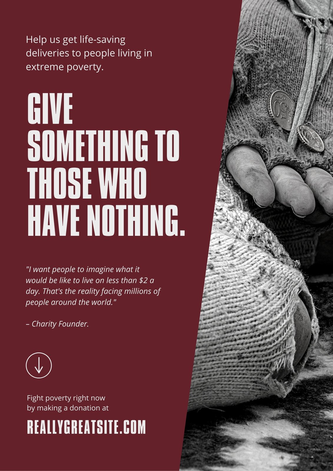


Comments
Post a Comment